Brand Foundations
Brand Story
Kable is an always on haven for users — a 24/7 companion, delivering networks of endless content catered to you and your individual moods and interests. Your taste doesn’t sleep.
Neither does Kable.
Kable is…
Personalized
Kable understands your tastes and knows exactly what you want to watch, when you want to watch it.
Reliable
Kable is the friend who is always there when you need them.
24/7
Kable never stops. Unlike traditional cable TV, Kable’s programming is prime time, all the time.
Things to avoid
Do not place gradients on colored backgrounds (or vice versa).

Do not combine colors with the same amount of contrast.
Don’t use high contrast colors on white.

Don’t use the gradient on text.
Don’t desaturate colors.

Don’t saturate colors.
Typography
The typefaces that define Kable’s brand.
From large headlines to detailed body text, Manrope ensures your message stands out while maintaining a professional aesthetic. Its open, inviting design makes it perfect for both digital and print applications, enhancing user experience across platforms.
Things to avoid
Don’t use Manrope for headlines.

Don’t use weights that are too light.

Don’t use weights that are too heavy.

Don’t mix weights.

Don’t use two different sizes.
Don’t put text on its side.
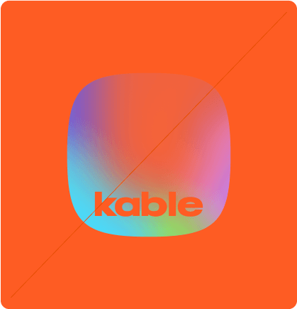
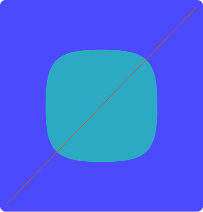
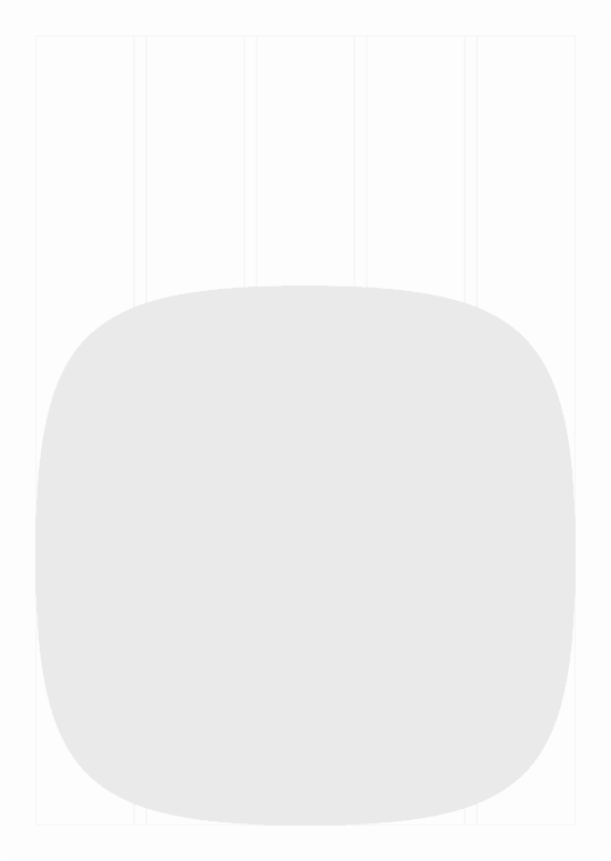
Graphic Elements
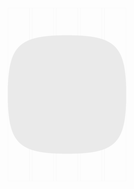
Kable’s “squircle” is the visual building across all brand applications, creating infinite creative opportunity.


Things to avoid

Don’t overlap squircles.

Don’t overlap squircles and text.
Don’t place the logo on inner squircles besides the middle.

Don’t stretch squircles (always maintain a 1:1 aspect ratio).

The squircle should never touch the border (unless being repeated).

Don’t use different size squircles in a grid.


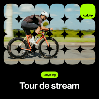
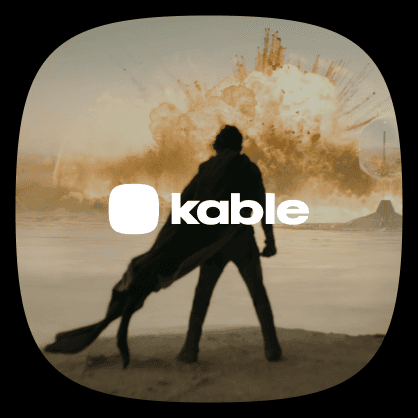
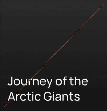
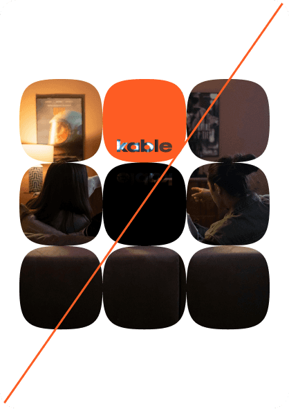
Media
How Kable’s brand shows up in media.